This notebook provides visual examples of how NDIndex slicing works using images. By wrapping an image in an xarray DataArray with 2D coordinates, we can see exactly what regions are selected by different slice operations.
import matplotlib.pyplot as plt
import numpy as np
import xarray as xr
from matplotlib import cbook
from matplotlib.patches import Rectangle

from linked_indices import NDIndex
from linked_indices.viz import visualize_slice_selection
Setup: Load an image and create 2D coordinates
We’ll use matplotlib’s sample image and create a 2D coordinate system where the coordinate values vary non-uniformly across the image.
# Load matplotlib sample image
with cbook.get_sample_data("grace_hopper.jpg") as image_file:
    gray = plt.imread(image_file).mean(axis=2)  # converting to grayscale for simplicity


fig, ax = plt.subplots(figsize=(6, 8))
ax.imshow(gray, cmap="gray")
ax.set_xlabel("x (pixels)")
ax.set_ylabel("y (pixels)")
ax.set_title(f"Original Image ({gray.shape[0]} × {gray.shape[1]} pixels)")
plt.tight_layout()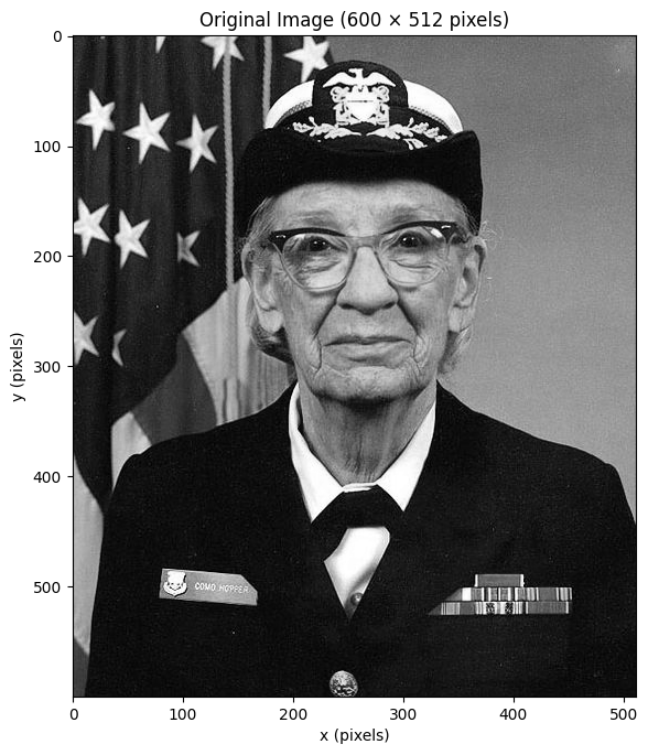
Create a 2D coordinate with unique values
Let’s create a 2D coordinate where each cell has a unique value.
We use derived = y * nx + x which is equivalent to the flat index.
This ensures scalar selection returns exactly one cell.
ny, nx = gray.shape

# Create 1D coordinates
y_coord = np.arange(ny)
x_coord = np.arange(nx)

# Create a 2D "derived" coordinate with UNIQUE values
# derived[y, x] = y * nx + x (like flat index)
# This ensures every cell has a distinct value
derived_coord = y_coord[:, np.newaxis] * nx + x_coord[np.newaxis, :]

# Visualize the derived coordinate
fig, axes = plt.subplots(1, 2, figsize=(12, 6))

ax = axes[0]
ax.imshow(gray, cmap="gray")
ax.set_title("Original Image")
ax.set_xlabel("x")
ax.set_ylabel("y")

ax = axes[1]
im = ax.imshow(derived_coord, cmap="viridis")
ax.set_title("2D Derived Coordinate\n(unique values: y*512 + x)")
ax.set_xlabel("x")
ax.set_ylabel("y")
plt.colorbar(im, ax=ax, label="derived value")

plt.tight_layout()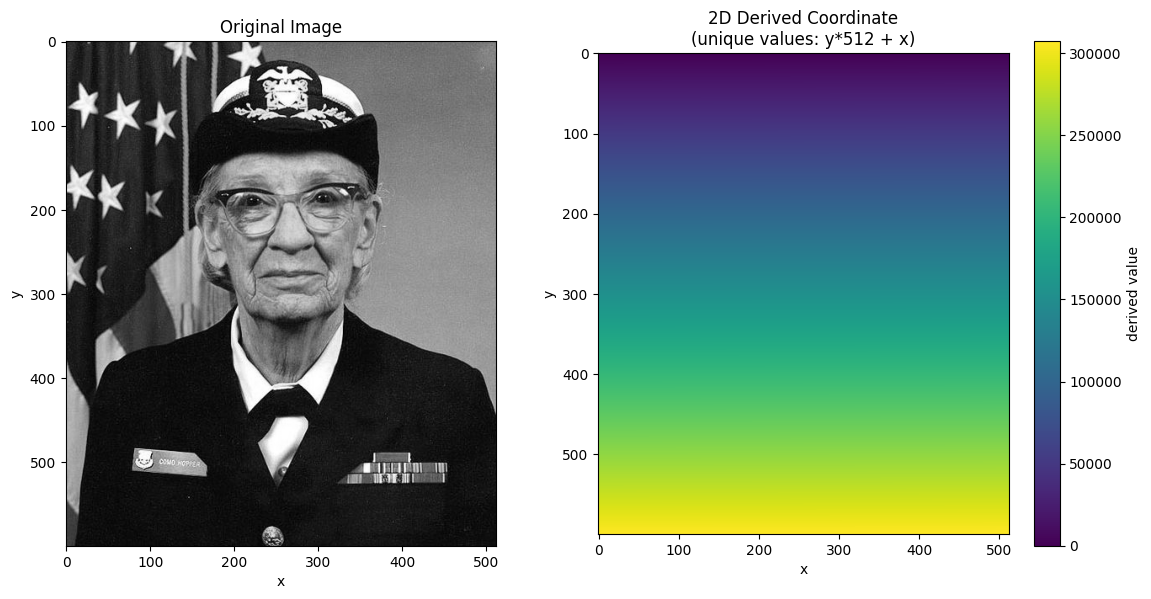
Create xarray DataArray with NDIndex
Now we wrap the image in an xarray DataArray and attach the 2D coordinate with NDIndex.
# Create DataArray
da = xr.DataArray(
    gray,
    dims=["y", "x"],
    coords={
        "y": y_coord,
        "x": x_coord,
        "derived": (["y", "x"], derived_coord),
    },
    name="image",
)

# Apply NDIndex to the 2D derived coordinate
da_indexed = da.set_xindex(["derived"], NDIndex)
da_indexedScalar Selection
Selecting a single value finds the cell with the value closest to the target. With unique values, the result is unambiguous - exactly one cell is returned.
# Select the cell at the center of the image
center_y, center_x = ny // 2, nx // 2
center_value = derived_coord[center_y, center_x]

print(f"Center of image: y={center_y}, x={center_x}")
print(f"Derived value at center: {center_value}")

result = da_indexed.sel(derived=center_value, method="nearest")
print(f"Selection result: y={result.y.item()}, x={result.x.item()}")
result
Center of image: y=300, x=256
Derived value at center: 153856
Selection result: y=300, x=256
# Select the cell at the center of the image
center_y, center_x = ny // 2, nx // 2
center_value = derived_coord[center_y, center_x]

result = da_indexed.sel(derived=center_value, method="nearest")
result# Visualize scalar selections at different values
fig, axes = plt.subplots(1, 2, figsize=(12, 6))
# Show image with selected points
ax = axes[0]
ax.imshow(gray, cmap="gray")
# Use values that span the coordinate range (0 to ~307,000)
targets = [50000, 100000, 150000, 200000, 250000]
colors = plt.cm.plasma(np.linspace(0, 1, len(targets)))
for target, color in zip(targets, colors):
result = da_indexed.sel(derived=target, method="nearest")
ax.plot(
result.x.item(),
result.y.item(),
"o",
color=color,
markersize=10,
label=f"derived={target:,}",
)
ax.legend(loc="upper right")
ax.set_title("Scalar Selection: Points where derived=target")
ax.set_xlabel("x")
ax.set_ylabel("y")
# Show derived coordinate with iso-lines
ax = axes[1]
im = ax.imshow(derived_coord, cmap="viridis")
# Draw contours for each target value with matching colors
for target, color in zip(targets, colors):
ax.contour(derived_coord, levels=[target], colors=[color], linewidths=2)
ax.set_title("Derived Coordinate with Iso-lines")
ax.set_xlabel("x")
ax.set_ylabel("y")
plt.colorbar(im, ax=ax)
plt.tight_layout()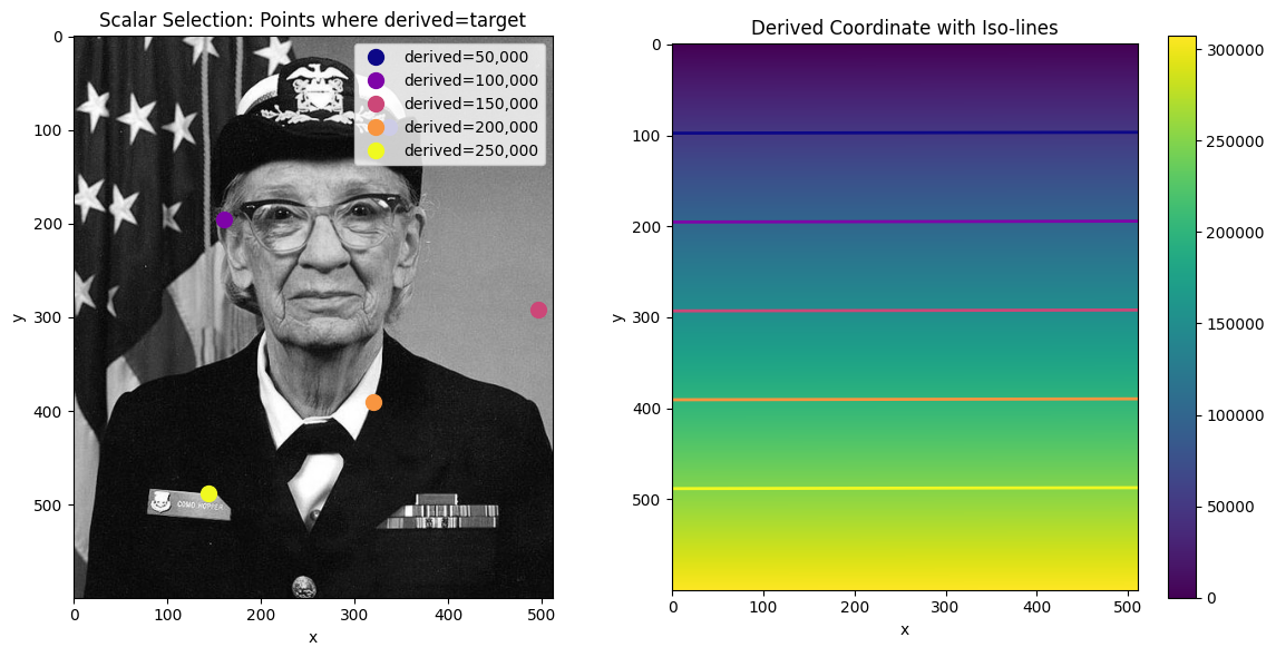
# Visualize scalar selections at different values
fig, ax = plt.subplots(figsize=(8, 10))
ax.imshow(gray, cmap="gray")

# Use values that span the coordinate range (0 to ~307,000)
targets = [50000, 100000, 150000, 200000, 250000]
colors = plt.cm.plasma(np.linspace(0, 1, len(targets)))

for target, color in zip(targets, colors):
    result = da_indexed.sel(derived=target, method="nearest")
    ax.plot(
        result.x.item(),
        result.y.item(),
        "o",
        color=color,
        markersize=12,
        markeredgecolor="white",
        markeredgewidth=2,
        label=f"derived={target:,}",
    )

ax.legend(loc="upper right")
ax.set_title("Scalar Selection at Different Values")
ax.set_xlabel("x")
ax.set_ylabel("y")
plt.tight_layout()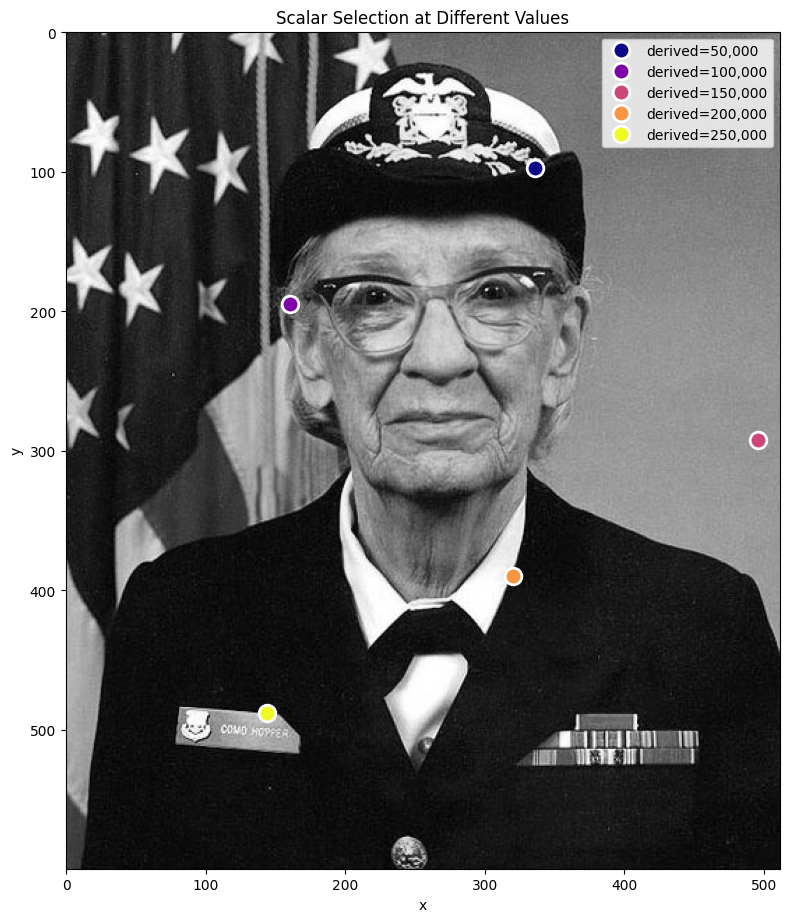
# Create a diagonal gradient with NON-UNIQUE values
# derived = 2*y + x means diagonal lines share the same value
diagonal_coord = y_coord[:, np.newaxis] * 2 + x_coord[np.newaxis, :]

# Visualize the diagonal coordinate and its duplicate structure
fig, axes = plt.subplots(1, 2, figsize=(12, 6))

ax = axes[0]
im = ax.imshow(diagonal_coord, cmap="viridis")
ax.set_title("Diagonal Gradient: derived = 2*y + x")
ax.set_xlabel("x")
ax.set_ylabel("y")
plt.colorbar(im, ax=ax, label="derived value")

# Show contour lines - these are the "iso-value" diagonals
ax = axes[1]
ax.imshow(gray, cmap="gray", alpha=0.5)
contours = ax.contour(diagonal_coord, levels=10, colors="red", linewidths=1)
ax.clabel(contours, inline=True, fontsize=8)
ax.set_title("Iso-value lines (diagonal)\nEach line = many cells with same value")
ax.set_xlabel("x")
ax.set_ylabel("y")

plt.tight_layout()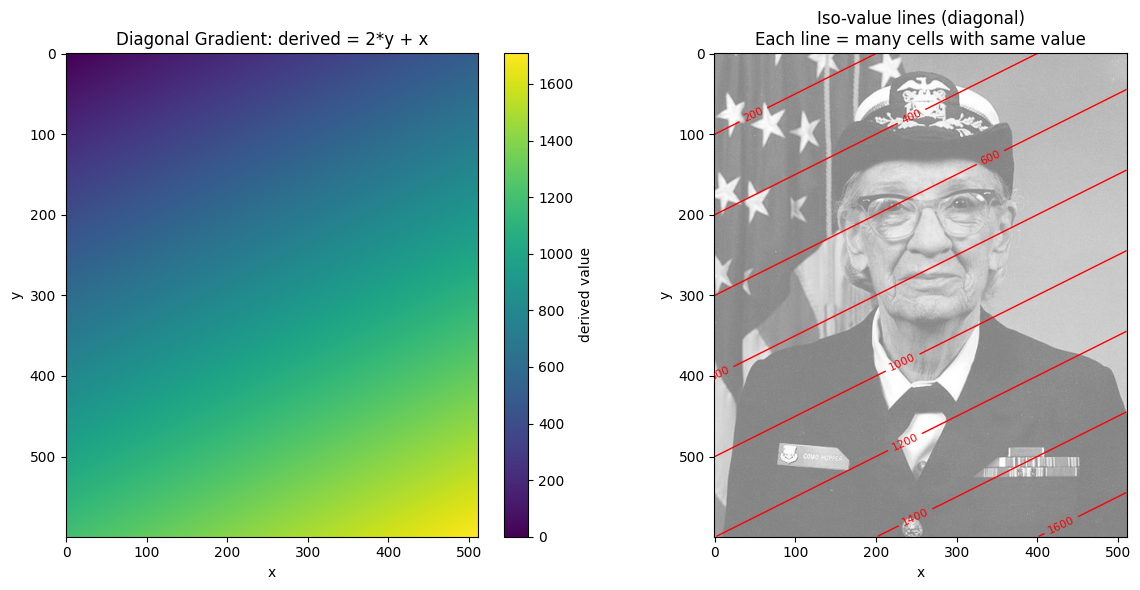
# Create DataArray with diagonal coordinate
da_diagonal = xr.DataArray(
    gray,
    dims=["y", "x"],
    coords={"y": y_coord, "x": x_coord, "diag": (["y", "x"], diagonal_coord)},
    name="image",
)
da_diagonal_indexed = da_diagonal.set_xindex(["diag"], NDIndex)

# Select by a value that has multiple matches
target_val = 856
result_diag = da_diagonal_indexed.sel(diag=target_val, method="nearest")

# Also try selecting the center's value
center_diag_val = diagonal_coord[300, 256]
result_center = da_diagonal_indexed.sel(diag=center_diag_val, method="nearest")

# Visualize: show where each selection lands
fig, ax = plt.subplots(figsize=(8, 10))
ax.imshow(gray, cmap="gray")

# Mark all cells with target_val
matches = np.argwhere(diagonal_coord == target_val)
for y, x in matches[::10]:  # Plot every 10th to avoid clutter
    ax.plot(x, y, "r.", markersize=3, alpha=0.5)

# Mark the selected cell
ax.plot(
    result_diag.x.item(),
    result_diag.y.item(),
    "ro",
    markersize=15,
    markeredgecolor="white",
    markeredgewidth=2,
    label=f"sel(diag={target_val})",
)

# Mark center and where center's value selection lands
ax.plot(
    256,
    300,
    "g^",
    markersize=12,
    markeredgecolor="white",
    markeredgewidth=2,
    label="Actual center (300, 256)",
)
ax.plot(
    result_center.x.item(),
    result_center.y.item(),
    "gs",
    markersize=12,
    markeredgecolor="white",
    markeredgewidth=2,
    label=f"sel(diag={center_diag_val}) → first match",
)

ax.legend(loc="upper right")
ax.set_title("Non-unique values: selection returns FIRST match in row-major order")
ax.set_xlabel("x")
ax.set_ylabel("y")
plt.tight_layout()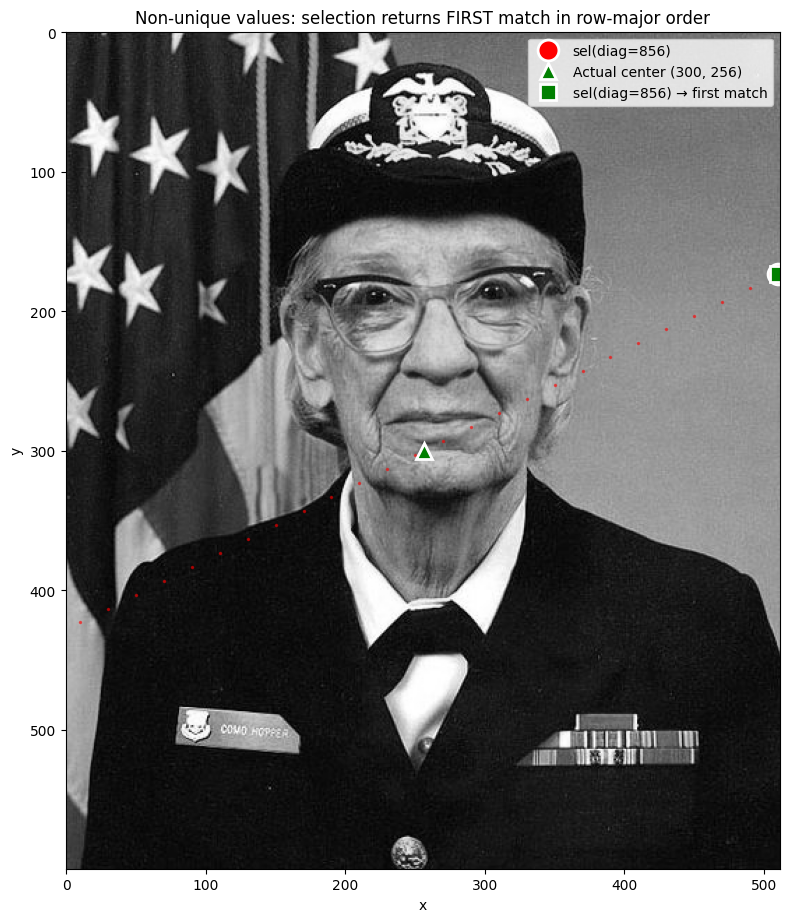
When multiple cells share the same coordinate value, method='nearest' returns the
first match in row-major (C) order — scanning left-to-right, top-to-bottom.
To select a specific cell among duplicates, use the dimension coordinates directly:
da.sel(y=300, x=256) # Specific cellSlice Selection: Bounding Box Behavior
When you select a range with slice(), NDIndex returns a bounding box - the smallest
rectangular region containing all cells with values in that range.
This is important: the bounding box may include cells outside your requested range!
# Select range: derived between 100000 and 150000
start, stop = 100000, 150000
result = da_indexed.sel(derived=slice(start, stop))

# Display the result - note how the bounding box includes values outside the range
resultvisualize_slice_selection(da_indexed, 100000, 150000);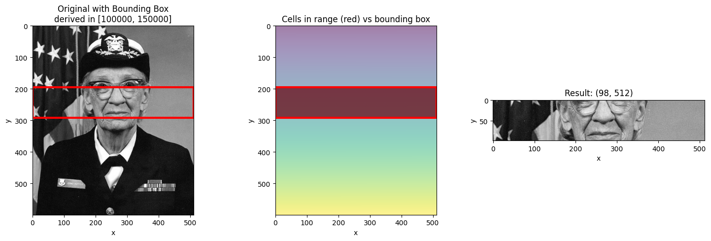
Different Slice Ranges
Let’s see how different ranges produce different bounding boxes.
# Narrow range - smaller bounding box
visualize_slice_selection(da_indexed, 150000, 160000);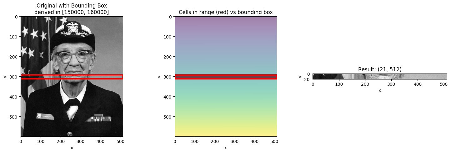
# Wide range - larger bounding box
visualize_slice_selection(da_indexed, 50000, 250000);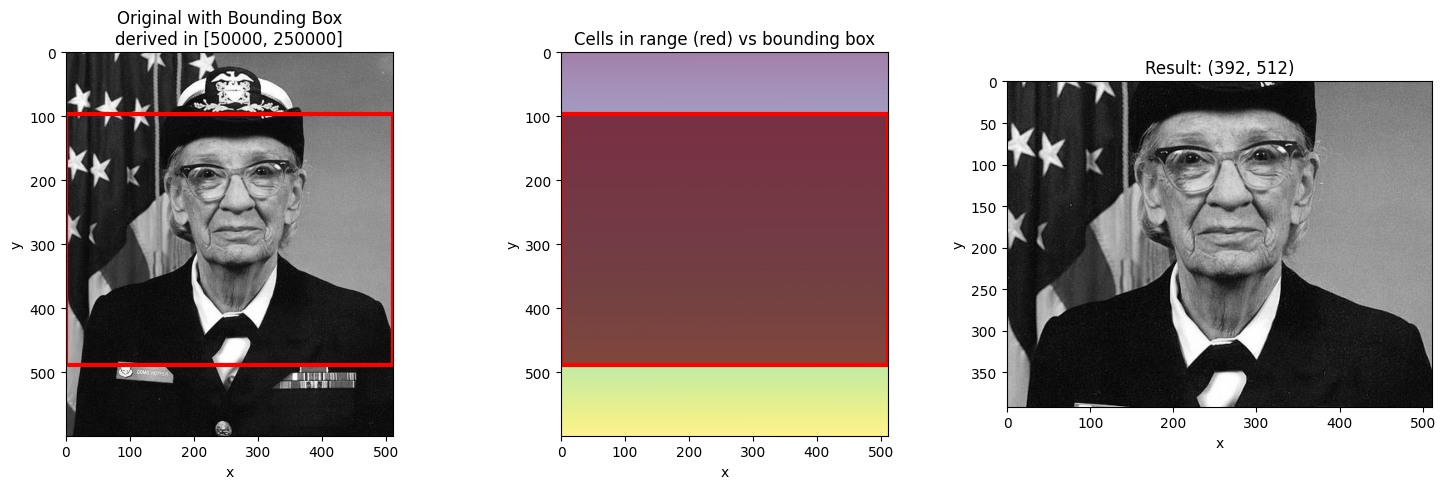
# Range at the edge
visualize_slice_selection(da_indexed, 0, 20000);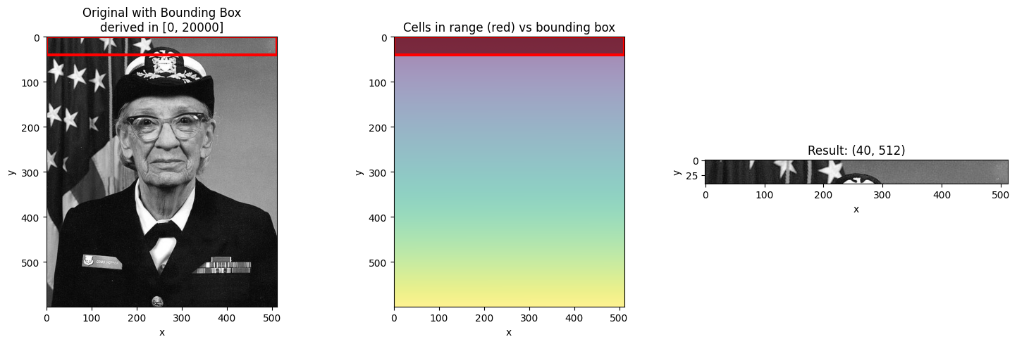
Filtering with .where() after Selection
Since the bounding box includes cells outside your requested range, you may want to
filter the result using .where() to mask out values not in the range.
start, stop = 100000, 150000
result = da_indexed.sel(derived=slice(start, stop))

# Filter to only show cells actually in range
in_range = (result.derived >= start) & (result.derived <= stop)
filtered = result.where(in_range)

fig, axes = plt.subplots(1, 3, figsize=(15, 5))

ax = axes[0]
ax.imshow(da_indexed.values, cmap="gray")
ax.set_title("Original")

ax = axes[1]
ax.imshow(result.values, cmap="gray")
ax.set_title("Bounding Box Result\n(includes cells outside range)")

ax = axes[2]
ax.imshow(filtered.values, cmap="gray")
ax.set_title("Filtered with .where()\n(only cells in range)")

plt.tight_layout()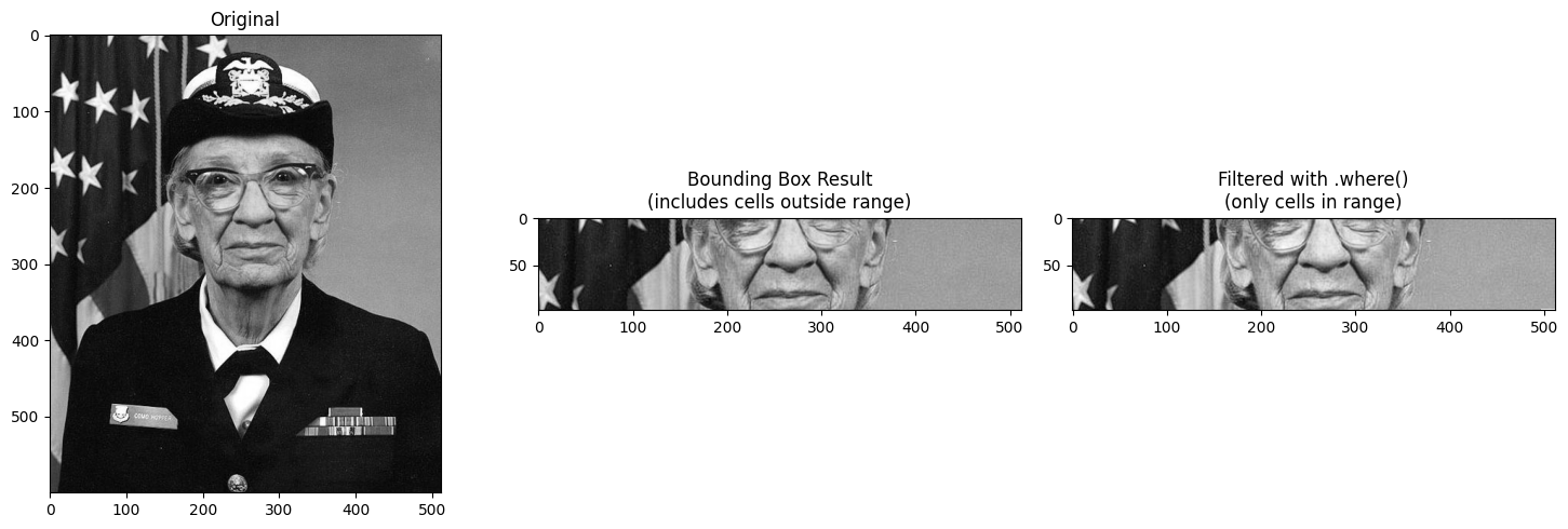
Using Step in Slices
You can include a step in the slice to subsample the innermost dimension.
start, stop = 100000, 200000

# Without step
result_no_step = da_indexed.sel(derived=slice(start, stop))

# With step=10 (subsample every 10th pixel in x)
result_with_step = da_indexed.sel(derived=slice(start, stop, 10))

# Visualize the difference
fig, axes = plt.subplots(1, 2, figsize=(12, 6))

ax = axes[0]
ax.imshow(result_no_step.values, cmap="gray", aspect="auto")
ax.set_title(f"slice({start}, {stop})\nShape: {result_no_step.shape}")
ax.set_xlabel("x")
ax.set_ylabel("y")

ax = axes[1]
ax.imshow(result_with_step.values, cmap="gray", aspect="auto")
ax.set_title(f"slice({start}, {stop}, 10)\nShape: {result_with_step.shape}")
ax.set_xlabel("x (subsampled)")
ax.set_ylabel("y")

plt.tight_layout()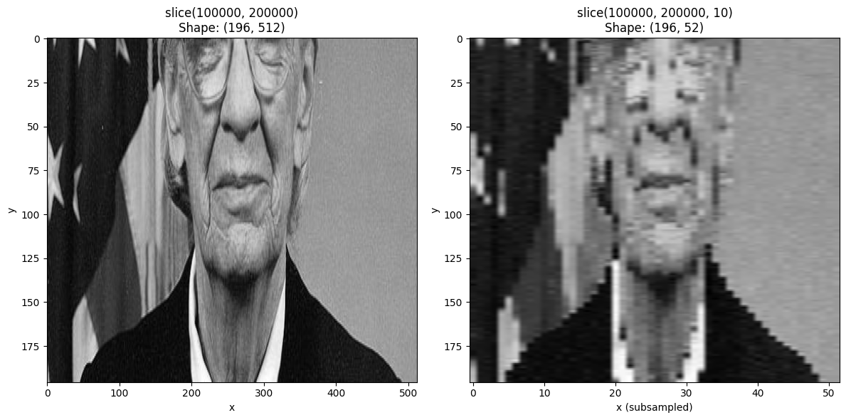
Non-Linear 2D Coordinates
The bounding box behavior becomes more interesting with non-linear coordinates. Let’s create a radial coordinate to see how this works.
# Create a radial coordinate centered on the image
cy, cx = ny // 2, nx // 2  # center
yy, xx = np.meshgrid(np.arange(ny) - cy, np.arange(nx) - cx, indexing="ij")
radial_coord = np.sqrt(xx**2 + yy**2)

# Create DataArray with radial coordinate
da_radial = xr.DataArray(
    gray,
    dims=["y", "x"],
    coords={
        "y": y_coord,
        "x": x_coord,
        "radius": (["y", "x"], radial_coord),
    },
    name="image",
)
da_radial_indexed = da_radial.set_xindex(["radius"], NDIndex)
fig, axes = plt.subplots(1, 2, figsize=(12, 6))
ax = axes[0]
ax.imshow(gray, cmap="gray")
ax.set_title("Original Image")
ax = axes[1]
im = ax.imshow(radial_coord, cmap="viridis")
ax.set_title("Radial Coordinate (distance from center)")
plt.colorbar(im, ax=ax, label="radius")
plt.tight_layout()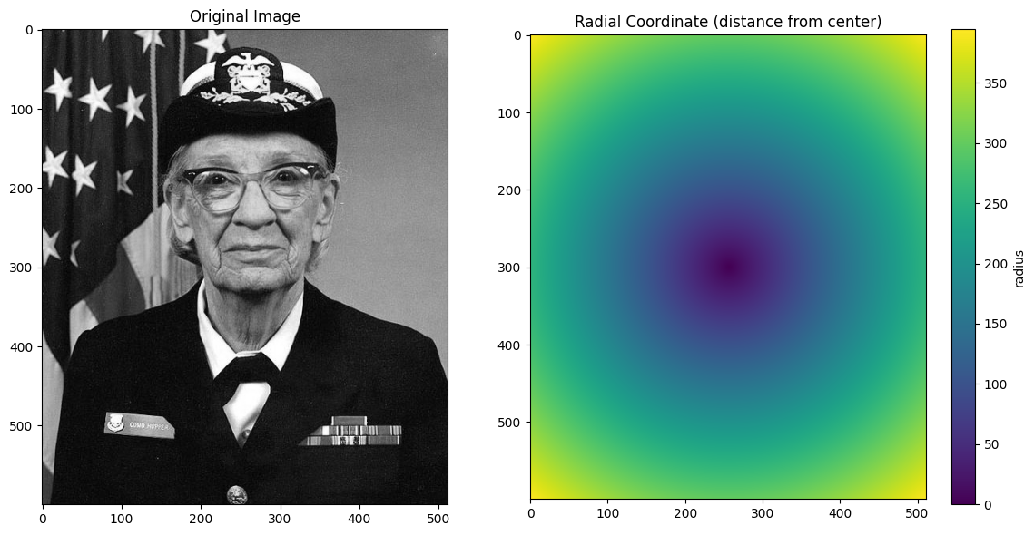
# Select center region - this shows the bbox "waste" dramatically
result = da_radial_indexed.sel(radius=slice(0, 100))

# Calculate waste: how many cells in bbox are NOT in the requested range
in_range = (result.radius >= 0) & (result.radius <= 100)
cells_in_range = int(in_range.sum())
cells_in_bbox = result.size
waste_pct = (1 - cells_in_range / cells_in_bbox) * 100

fig, axes = plt.subplots(1, 3, figsize=(15, 5))

ax = axes[0]
ax.imshow(da_radial_indexed.values, cmap="gray")
# Draw the bbox outline
y_min, y_max = result.y.values.min(), result.y.values.max()
x_min, x_max = result.x.values.min(), result.x.values.max()
rect = Rectangle(
    (x_min, y_min),
    x_max - x_min,
    y_max - y_min,
    linewidth=2,
    edgecolor="red",
    facecolor="none",
)
ax.add_patch(rect)
ax.set_title("Original with Bounding Box")
ax.set_xlabel("x")
ax.set_ylabel("y")

ax = axes[1]
ax.imshow(result.values, cmap="gray")
ax.set_title(
    f"Bounding Box Result\nShape: {result.shape}\n{cells_in_bbox:,} total cells"
)
ax.set_xlabel("x")
ax.set_ylabel("y")

ax = axes[2]
# Show which cells are actually in range vs wasted
ax.imshow(in_range.values, cmap="RdYlGn", vmin=0, vmax=1)
ax.set_title(
    f"Cells actually in range\n{cells_in_range:,} in range, {waste_pct:.1f}% waste"
)
ax.set_xlabel("x")
ax.set_ylabel("y")

plt.tight_layout()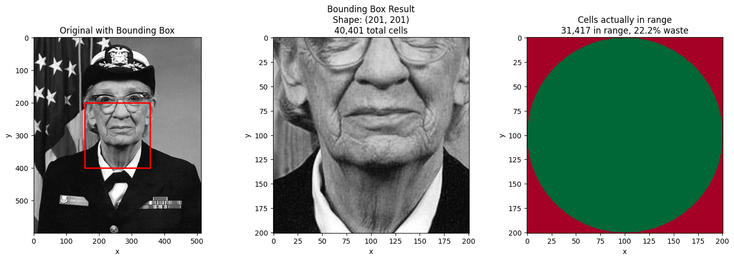
Small Grid Example: Seeing Individual Cells
To make the bounding box behavior crystal clear, let’s use a tiny 10×10 grid where we can see exactly which cells are selected vs which are “wasted” in the bbox.
# Create a small 10x10 grid with radial coordinate
n = 10
cy, cx = n // 2, n // 2  # center at (5, 5)
yy_small, xx_small = np.meshgrid(np.arange(n) - cy, np.arange(n) - cx, indexing="ij")
radius_small = np.sqrt(xx_small**2 + yy_small**2)

# Create synthetic "data" - just use the radius values for clarity
da_small = xr.DataArray(
    radius_small,  # data = radius for easy interpretation
    dims=["y", "x"],
    coords={
        "y": np.arange(n),
        "x": np.arange(n),
        "radius": (["y", "x"], radius_small),
    },
)
da_small_indexed = da_small.set_xindex(["radius"], NDIndex)

# Select radius in [2, 4] - this is a ring
r_start, r_stop = 2, 4
result_small = da_small_indexed.sel(radius=slice(r_start, r_stop))
in_range_small = (result_small.radius >= r_start) & (result_small.radius <= r_stop)

fig, axes = plt.subplots(1, 3, figsize=(14, 5))

# Original grid with all radius values
ax = axes[0]
im = ax.imshow(radius_small, cmap="viridis", vmin=0, vmax=7)
for i in range(n):
    for j in range(n):
        ax.text(
            j,
            i,
            f"{radius_small[i, j]:.1f}",
            ha="center",
            va="center",
            fontsize=8,
            color="white" if radius_small[i, j] > 3 else "black",
        )
ax.set_title(f"Full {n}×{n} Grid\n(radius values)")
ax.set_xlabel("x")
ax.set_ylabel("y")
plt.colorbar(im, ax=ax, label="radius")

# Bounding box result
ax = axes[1]
im = ax.imshow(result_small.values, cmap="viridis", vmin=0, vmax=7)
ny_res, nx_res = result_small.shape
for i in range(ny_res):
    for j in range(nx_res):
        val = result_small.values[i, j]
        in_r = in_range_small.values[i, j]
        color = "white" if val > 3 else "black"
        weight = "bold" if in_r else "normal"
        ax.text(
            j,
            i,
            f"{val:.1f}",
            ha="center",
            va="center",
            fontsize=8,
            color=color,
            fontweight=weight,
        )
ax.set_title(
    f"Bounding Box: sel(radius=slice({r_start}, {r_stop}))\n"
    f"Shape: {result_small.shape} = {result_small.size} cells"
)
ax.set_xlabel("x")
ax.set_ylabel("y")

# Highlight which cells are actually in range
ax = axes[2]
ax.imshow(in_range_small.values, cmap="RdYlGn", vmin=0, vmax=1)
in_count = int(in_range_small.sum())
waste_count = result_small.size - in_count
for i in range(ny_res):
    for j in range(nx_res):
        val = result_small.radius.values[i, j]
        in_r = in_range_small.values[i, j]
        marker = "Y" if in_r else "X"
        ax.text(
            j,
            i,
            f"{val:.1f}\n{marker}",
            ha="center",
            va="center",
            fontsize=7,
            color="black",
        )
ax.set_title(
    f"In range? (Y=yes, X=no)\n{in_count} in range, {waste_count} wasted ({100 * waste_count / result_small.size:.0f}%)"
)
ax.set_xlabel("x")
ax.set_ylabel("y")

plt.tight_layout()
Key insight: The bounding box contains all cells with radius values in [2, 4], but it’s a rectangle that must also include the corner cells (which have larger radius values).
This is fundamental to how xarray indexing works - sel() returns contiguous slices along
each dimension. For non-rectangular regions (like circles, rings, or diagonal bands),
use returns='mask' with nd_sel() to mask out the unwanted cells.
Summary: Bounding Box Behavior
Key points about NDIndex slicing with standard ds.sel():
Scalar selection finds the single cell closest to the target value
Slice selection returns a bounding box containing all cells in range
The bounding box may include cells outside your requested range
Use
.where()after selection to mask out values not in rangeUse
slice(start, stop, step)to subsample the innermost dimension
Non-Rectangular Selection with nd_sel
The standard ds.sel() always returns a rectangular bounding box. But sometimes you want
only the cells actually in your requested range, with everything else masked out.
Why a Helper Function?
xarray’s custom index protocol (Index.sel()) returns an IndexSelResult which contains
indexers for each dimension. These can be slices, integer arrays, or boolean arrays.
While IndexSelResult can express non-rectangular selections via boolean arrays, it cannot:
Apply masks to data values (setting cells to NaN while preserving the array shape)
Add new coordinates (like a boolean membership indicator)
The index tells xarray which indices to select, but it doesn’t have access to the actual data values to modify them. That’s why we need a helper function that:
First calls
ds.sel()to get the bounding box (fast, O(log n))Then applies the mask or adds the metadata coordinate as a post-processing step
The returns Parameter
The nd_sel helper function provides non-rectangular selection with the returns parameter:
| Mode | Behavior | Creates Copy? |
|---|---|---|
returns='slice' | Standard bounding box (same as ds.sel()) | No (view) |
returns='mask' | Bounding box with NaN outside the range | Yes (via .where()) |
returns='metadata' | Bounding box + boolean coordinate showing membership | No (view) |
from linked_indices import nd_sel

# Compare the three return modes
start, stop = 100000, 150000

# Standard slice (bounding box)
result_slice = nd_sel(da_indexed, derived=slice(start, stop), returns="slice")

# Mask mode: NaN outside range
result_mask = nd_sel(da_indexed, derived=slice(start, stop), returns="mask")

# Metadata mode: boolean coordinate added
result_meta = nd_sel(da_indexed, derived=slice(start, stop), returns="metadata")

# All three have the same shape, but different content
fig, axes = plt.subplots(1, 3, figsize=(15, 5))

ax = axes[0]
ax.imshow(result_slice.values, cmap="gray")
ax.set_title(f"returns='slice'\nShape: {result_slice.shape}")

ax = axes[1]
ax.imshow(result_mask.values, cmap="gray")
ax.set_title(f"returns='mask'\nShape: {result_mask.shape}")

ax = axes[2]
ax.imshow(result_meta.coords["in_derived_range"].values, cmap="RdYlGn", vmin=0, vmax=1)
ax.set_title("returns='metadata'\nAdds 'in_derived_range' (bool)")

for ax in axes:
    ax.set_xlabel("x")
    ax.set_ylabel("y")

plt.tight_layout()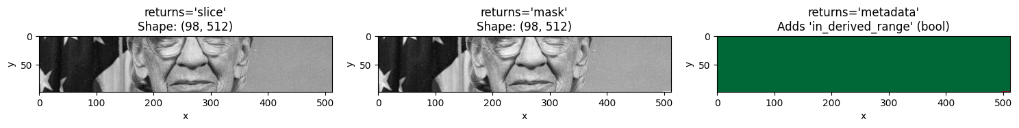
Radial Selection with Masking
The mask mode is especially useful with non-linear coordinates like radial distance. With bounding box selection, an annulus (ring) returns a rectangle. With masking, you get just the ring.
# Select a ring (annulus) with different return modes
r_start, r_stop = 100, 150

# Bounding box (standard)
ring_slice = nd_sel(da_radial_indexed, radius=slice(r_start, r_stop), returns="slice")

# Masked - only the ring, rest is NaN
ring_mask = nd_sel(da_radial_indexed, radius=slice(r_start, r_stop), returns="mask")

# Calculate NaN statistics for display
nan_count = np.isnan(ring_mask.values).sum()
total_count = ring_mask.size

fig, axes = plt.subplots(1, 3, figsize=(15, 5))

ax = axes[0]
ax.imshow(da_radial_indexed.values, cmap="gray")
ax.set_title("Original Image")

ax = axes[1]
ax.imshow(ring_slice.values, cmap="gray")
ax.set_title(f"returns='slice'\nShape: {ring_slice.shape}")

ax = axes[2]
ax.imshow(ring_mask.values, cmap="gray")
ax.set_title(f"returns='mask'\n{nan_count:,} NaN / {total_count:,} total")

for ax in axes:
    ax.set_xlabel("x")
    ax.set_ylabel("y")

plt.tight_layout()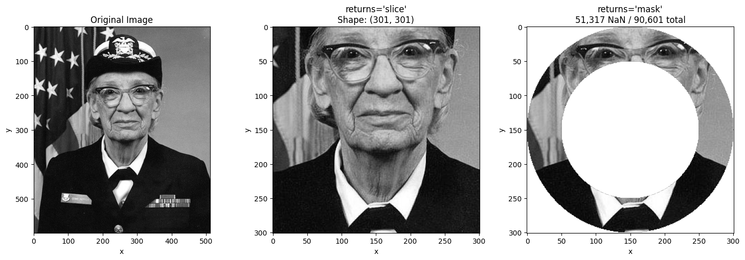
Combining with method='nearest'
You can combine returns='mask' with method='nearest' to snap boundaries to the
nearest existing values before applying the mask.
# Use nearest to snap boundaries
# Request radius 95-155, which snaps to nearest actual values
ring_nearest = nd_sel(
    da_radial_indexed,
    radius=slice(95, 155),  # Not exact values in the coordinate
    method="nearest",
    returns="mask",
)

fig, axes = plt.subplots(1, 2, figsize=(12, 5))

ax = axes[0]
ax.imshow(ring_mask.values, cmap="gray")
ax.set_title("Exact: radius in [100, 150]")
ax.set_xlabel("x")
ax.set_ylabel("y")

ax = axes[1]
ax.imshow(ring_nearest.values, cmap="gray")
ax.set_title("Nearest: radius in [95, 155]\n(snapped to nearest values)")
ax.set_xlabel("x")
ax.set_ylabel("y")

plt.tight_layout()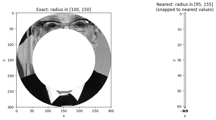
Using the Boolean Coordinate from returns='metadata'
The returns='metadata' mode adds a boolean coordinate that you can use for
custom filtering, statistics, or visualization.
# Get result with membership metadata
result_with_meta = nd_sel(da_radial_indexed, radius=slice(100, 150), returns="metadata")

# Use the boolean coordinate for statistics
in_ring = result_with_meta.coords["in_radius_range"]
mean_in = result_with_meta.where(in_ring).mean().item()
mean_out = result_with_meta.where(~in_ring).mean().item()

fig, axes = plt.subplots(1, 2, figsize=(12, 5))

ax = axes[0]
ax.imshow(result_with_meta.values, cmap="gray")
ax.set_title(f"Data values\nMean in ring: {mean_in:.1f}")
ax.set_xlabel("x")
ax.set_ylabel("y")

ax = axes[1]
ax.imshow(in_ring.values, cmap="RdYlGn", vmin=0, vmax=1)
ax.set_title(f"in_radius_range coordinate\n{in_ring.sum().item():,} pixels in ring")
ax.set_xlabel("x")
ax.set_ylabel("y")

plt.tight_layout()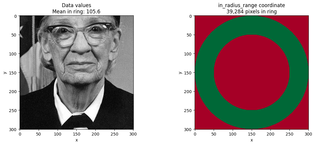
Summary
The nd_sel helper function extends NDIndex selection with three return modes:
from linked_indices import nd_sel

# Standard bounding box (same as ds.sel())
result = nd_sel(ds, coord=slice(start, stop), returns='slice')

# Mask values outside range with NaN
result = nd_sel(ds, coord=slice(start, stop), returns='mask')

# Add boolean coordinate for custom processing
result = nd_sel(ds, coord=slice(start, stop), returns='metadata')
Key points:
All modes first compute the O(log n) bounding box, then apply post-processing
returns='mask'creates a copy (via.where())returns='metadata'preserves views, just adds a coordinateCombine with
method='nearest'to snap boundaries to nearest valuesThe helper is needed because xarray’s
IndexSelResultcannot apply masks to data values